Monitoring & Customer App
A mobile app that provides the means to monitor a photovoltaic system, and serve as the basis for maintaining a long term relationship between the company and the customer
Info
- Role
- Product Designer
- Timeline
- March - October 2023
- Tools
- Figma
- Analytics / Research / Clarity
- React Native
Overview
Problem
After installation EIGENSONNE would usually say goodbye to the customer. How can they better establish an ongoing relationship with them? How can they offer more value to the customer.
Outcome
I designed an intuitive & enjoyable proprietary app. Providing energy monitoring, unique data breakdowns, weather and support. Building a component based modular design system, and providing additional feature designs for later feature releases.
UX Research
UI Design
Research
Understanding
In our pursuit of creating a user-centric app, we conducted comprehensive competitor analysis and gathered insights through colleague interviews. These efforts were instrumental in identifying key factors crucial for enhancing user experience and maximizing app utility.
Early in the development process, we delineated our differentiation strategy from competitors, specifically targeting a user base distinct from those catered to by existing advanced-level apps. Our approach centered on presenting essential data points in a user-friendly format, prioritising simplicity and accessibility.
Recognising the technical nature of our product, we placed a strong emphasis on fostering trust and confidence among users. To achieve this, we implemented robust systems health indicators, comprehensive FAQ sections, and intuitive energy flow interfaces. These elements not only instill user confidence but also contribute to a significant reduction in support requests, thereby streamlining user engagement and satisfaction.Wireframe
 Top level wireframe pages
App Map / User Flow
 Application Map / User Flow
Iterative Prototyping
We adopted an iterative approach by initiating rolling prototypes early in the development process. This strategy facilitated efficient stakeholder buy-in, enabled comprehensive feedback collection, and facilitated early detection and resolution of potential issues.
An initial testing phase involved the presentation of a relatively high-fidelity prototype to a diverse sample of approximately 15 existing customers. This exercise aimed to validate our initial objectives and assumptions regarding user preferences and needs.
Through this testing phase, we were able to validate our colour selections, which were meticulously chosen based on color theory principles, and confirm the effectiveness of our concise data presentation approach. Additionally, valuable insights were gleaned regarding features that would significantly enhance user experience, such as a 5-day weather forecast and detailed sunshine hour information. These findings further informed our iterative design process, ensuring alignment with user expectations and preferences.
Design
Approach
Adhering to foundational principles in mobile design, I implemented thumb-sized, rounded, and responsive elements for all interactions within the app. By leveraging native iOS and Android interface elements and behaviors, such as swiping and drawers, instead of reinventing established patterns, we ensured an intuitive user experience.
This approach ensured that interactions were not only easy and satisfying but also aligned with users' expectations for responsiveness and functionality. By employing well-sized and properly spaced elements that react as users anticipate, we mitigated decision fatigue caused by interface uncertainty.
Feedback from our early testers underscored the success of these design choices. They particularly appreciated the ability to quickly gauge their system's performance with a glance, emphasising the importance of easily accessible data for optimising their appliance usage, such as determining the best time to run large appliances like washing machines. This user-centric design philosophy not only enhances usability but also empowers users to make informed decisions in their daily routines. Medium Fidelity Mockups
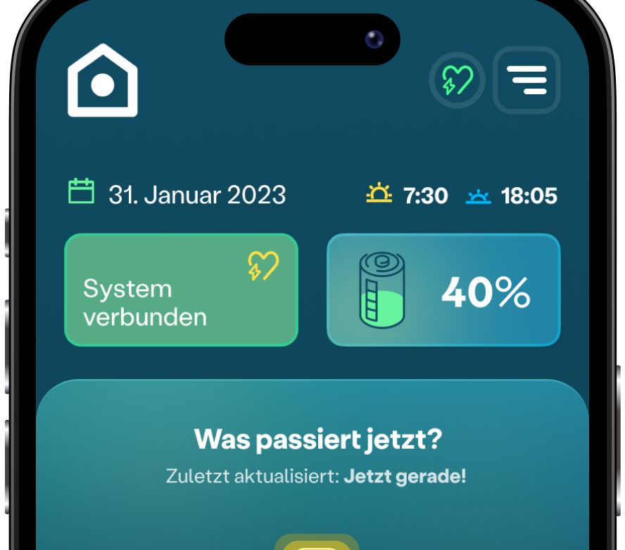
The positive feedback and user engagement stemming from our initial design choices reinforced our commitment to a clear and simple interface. We maintained this approach by incorporating easily digestible elements, such as an intuitive energy flow diagram, prominently displaying key metrics like battery charge, and providing clear visualizations of generation and consumption levels on the dashboard or first screen.
Innovatively, we employed variable speeds of animation within the energy flow diagram to represent the intensity of energy flows. This dynamic feature, coupled with straightforward breakdowns of production versus consumption, ensured that users could quickly grasp complex energy dynamics with just a glance. By prioritising glance value and facilitating the effortless consumption of data, we further enhanced the usability and utility of our app interface.
My approach involved dissecting crucial data points into easily understandable designs that fostered logical and seamless interactions with associated values. By structuring these designs in an intuitive and cohesive manner, users could effortlessly discern the relationships between production and consumption metrics, along with their respective breakdowns.
For instance, users could readily identify disparities between production and consumption levels, grasp their interrelatedness, and comprehend the breakdowns that elucidate these dynamics. This design philosophy ensured that users could efficiently navigate and derive insights from the data presented, thereby enhancing the overall usability and effectiveness of the app interface.
 Dark mode dashboard prototype (alpha test)
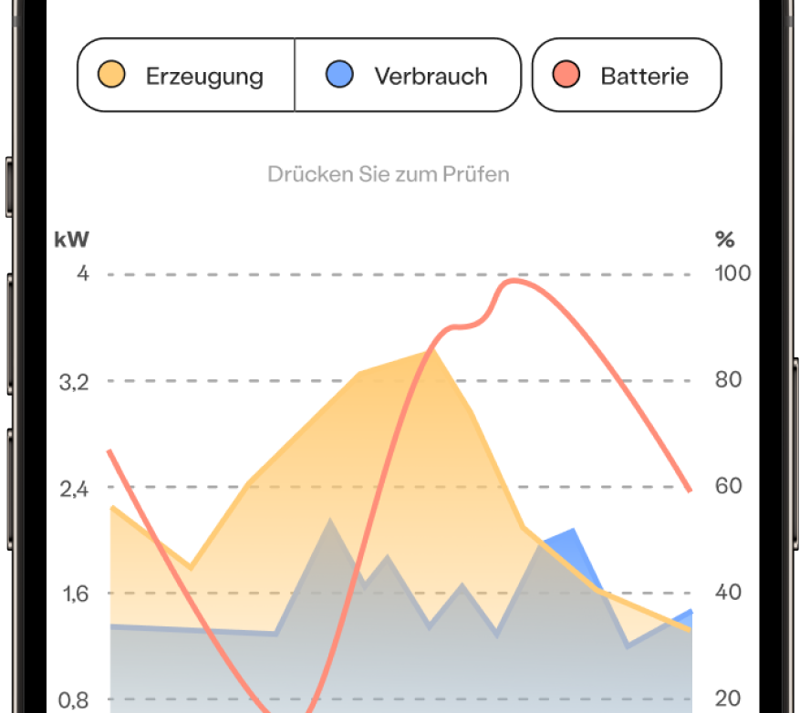 Light mode daily graph prototype (beta test)
Colours
Our color palette was meticulously chosen to optimise user experience. Following extensive research into color psychology, we settled on a teal base due to its associations with calmness, serenity, and balance. This choice not only ensures visual comfort but also distinguishes our app within the industry, as teal is predominantly utilised by premium brands such as Tiffany & Co.
By leveraging the psychological impact of color, we aimed to evoke positive emotions and promote a sense of tranquility among users interacting with our app. This strategic color selection enhances brand identity while fostering an environment conducive to user engagement and satisfaction.
Native
Drawing on my engineering expertise, particularly with React, I collaborated closely with the development team to ensure the seamless implementation of our design system. Our goal was to deliver a solution that could be effortlessly integrated, guaranteeing compatibility with React Native for swift and efficient development.
By aligning the design system with the technical capabilities of React and React Native, we streamlined the development process, minimising potential obstacles and maximizing productivity. This collaborative approach between design and development facilitated the creation of a cohesive and functional app that met both design and technical requirements seamlessly.
Results
Adopting an iterative approach throughout the development cycle, we conducted rigorous testing at each milestone. Following the completion of the initial development phase, we conducted additional rounds of testing, uncovering valuable insights that eluded us in the initial assessment.
One notable revelation from this testing phase was the ambiguity surrounding the heart icon positioned atop the interface, intended to signify system health and connection status. In response, I redesigned this element to provide a clearer indication of connection status, while relocating the system health indicator to a prominent block within the dashboard, as exemplified by the "System Verbunden" block.
Despite this minor adjustment, feedback from testers was overwhelmingly positive. Their enthusiasm and confidence in the app surpassed that of competitors' offerings and even the hardware manufacturer's own app. Eager anticipation for the app's forthcoming release in Q1 2024 was palpable among testers, many expressing their intent to become early adopters.
This project underscores the importance of early and frequent user engagement. While data-driven insights are invaluable, genuine user feedback remains paramount. By prioritising user input and iterative refinement, we crafted an app that not only meets but exceeds user expectations, setting a high standard for user experience in the industry.